By John Rylands Library I sat down and wept…

rylands1.jpg

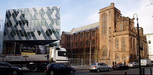
While the scholastic gloom of Basil Champneys’s John Rylands Library (1899) on Deansgate in Manchester perhaps offers no direct model for contemporary emulation, the quality of its construction and longevity of its use and occupation present a sharp riposte to the disposable buildings and spaces of today. This lamentable situation is exemplified by the latest miserable product of retail/office space, 2 Spinningfields Square, which has appeared adjacent to the “last significant flowering of Gothic in the city”.

screenshot4.jpg

It is difficult to know how to account for such a situation. Apparently the product of a masterplan, the office buildings of the Spinningfields development stand around the area awkwardly misaligned with each other and unconvincingly heterogenous in their exterior forms, different wrappings around the same sort of functional space. But at least they have a genuine potential for use, unlike the public realm of the area, where the same futile decorative mentality attempts to modify the obvious meaninglessness of the space. Throughout the Spinningfields development the public spaces are particularly redundant, lacking the sort of fluid changes of occupation one would witness in an authentic place. The new spaces are there to provide hierarchy to otherwise largely indistinguishable buildings, to ‘add value’ in the cost per square metre of an address on a ‘square’, over one on a ‘boulevard’, over one on an ‘avenue’. Urban space in these situations is part of the commodification of urban property rather than providing a genuinely public realm.

screenshot3.jpg

Looking ahead, the new spaces created as part of the Spinningfields development are so stupendously formless they can only indicate their eventual occupation by yet more office building. Large patches of lawn suggest future development plots which might give more definition to these late manifestations of s.l.o.a.p. (space left over after planning). Lines of skater-proof benches provide rhythm of potential occupation, although hard up against the glass elevation of the Civil Justice Centre, they offer little prospect of comfort, let alone a view. In Hardman Square the enigmatic forms of polished black stone attempt to provide interest to the yawning space which opens out towards the monuments of early twentieth century Manchester, the rear and stage door of Sir Albert Richardson’s Opera House and the roofscape of Joseph Sunlight’s Sunlight House. This public space complements the essentially private functions of the work place, while the cultural and civic monuments, the Rylands Library, the Crown Court and (perhaps thankfully) the new Magistrates’ Court struggle for a public presence against their newer, attention seeking, commercial neighbours, with their V-sign columns, confusingly suppressed entrances, ineffective signage, and the visual detritus of internal occupation.

screenshot2.jpg

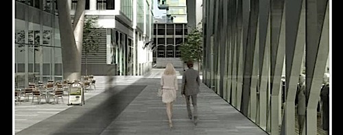
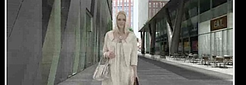
The package of aspirations which the occupant is offered by Spinningfields represents a particularly impoverished form of urbanism. Attention lights on the palette of accumulated brands precisely because the physical environment (buildings and spaces) in which they are contained is so banal and devoid of consolation. Individuality is reduced to the illumination of corporate logos and the complexity provided by a gratuitous and hard to occupy plan form, producing 2 Spinningfields Square as a reductio ad absurdam. Nothing more underlines the inappropriateness of this particular commercial bauble to the present economic circumstances than the promotional CGI film where two
improbably refined financial services employees divert themselves with a few minutes of retail therapy before the inevitable arrival of their redundancy notices. Go to www.theavenuemanchester.com and click the link to TAKE A WALK.

screenshot27.jpg

Posted in Aventinus, CiA, Manchester | Tagged , | 2 Comments

Mont-de-Huisnes, Normandy

mdh1_1.jpg

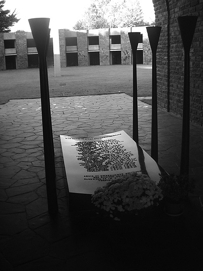
This German war cemetery, Mont-de-Huisnes, Normandy, 1967, is very beautifully detailed. From the grass roof one has a view of Mont-Saint-Michel rising like a mystic city from the sea.

Volksbund Deutsche Kriegsgräberfürsorge

(Peoples Association for the Care of German War Graves)

Posted in CiA, Crompton, Travel | 2 Comments

Valley roll

valley

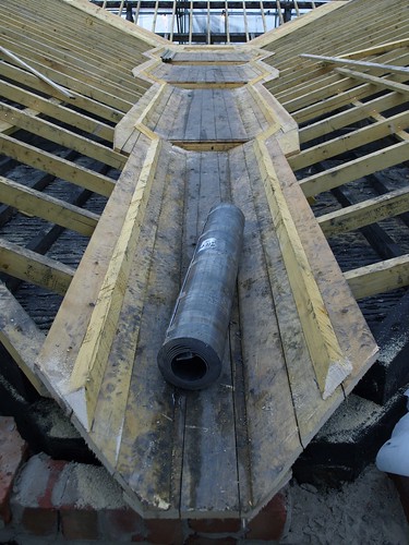
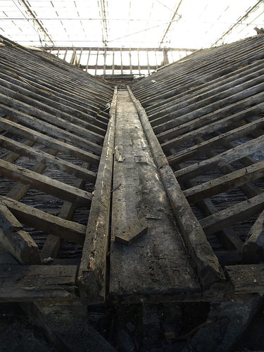
New stepped valley constructed in timber and according with best practice. Ready for lining.

With the tapered gutter, the pitched roof merges into the sole of the gutter without upstands. Thus, according to the fall of the gutter and the pitch of the roof, the gutter is wider at its highest point than at its lowest, the lower the pitch the more the gutter widens.*

Compare with…

*from Lead Sheet in Building published by the LDA 1978

Posted in Architecture Hacks, CiA, Dominic Roberts, Practice | 1 Comment

Geography & Creativity

screenshot1.jpeg

In a very interesting episode of In Business this week, Peter Day was talking to Richard Florida, the author of Rise of the Creative Classes and the Director of the Martin Institute of Prosperity in Toronto.

Florida discusses the connection between musicians and other types of creative talent and the development of cities. “Geography and Creativity”, he explained, is the new spatial order.

Radio 4

Creative Class

Posted in CiA, Sally Stone | Comments Off on Geography & Creativity

Interior Architecture: Context & Environment

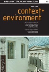
screenshot.jpeg

CiA staffer Sally Stone and her co-author Graeme Brooker have just had their second book in the Basic Interior Architecture series published.

“Context & Environment” examines the ways in which elements based both inside and outside of the host building can influence and effect the interior space. The book proposes a method of interpretation, evaluation and utilisation of physical factors, such as light and orientation, the contextual issues of the urban form and the subject of sustainability, and their influences on the design of the interior and the remodelling of existing buildings.

Amazon link: Basics Interior Architecture: Context and Environment

Posted in CiA, Interiors, Publications, Research, Sally Stone | Comments Off on Interior Architecture: Context & Environment

Back to school

geometry-2.jpg

geometry1.jpg

Basilica Palladiana: Geometry studies by Sophie Corkhill, BArch student Manchester School of Architecture.

Posted in Andrea Palladio, CiA, Dominic Roberts, Italy, Student Projects, Students | Comments Off on Back to school

Eric Parry in the FT

At its heart it’s all about this ‘citiness’, about contributing to the building and the culture of the city. The European city has proved itself the most fascinating receptacle for culture and perhaps it’s a bit of a cheek leaving stuff in the city for ever. But if you thought about it too earnestly, you’d freeze.

Eric Parry talks to the Financial Times: LINK

Eric Parry Architects 

Posted in CiA, Dominic Roberts | Comments Off on Eric Parry in the FT

When breathed upon or otherwise rendered moist

_C095890.JPG

Two hundred year old roof, Lake District UK. Lead dowel used to fix slates to battens. It is more usual to find timber dowels or iron nails.

_C095892.JPG

Westmorland slates reclaimed from the roof.

Slates are tested for quality by their thickness, clean smooth cleavage, toughness to allow of holing for nails, and resistance to water. A good slate partially immersed in water should not absorb water to any appreciable extent above the water line…It should also give a clear ring when struck with the knuckles and when breathed upon or otherwise rendered moist, should not emit a clayey odour.

From Architectural Building Construction Vol 2 by Jaggard & Drury, Cambridge University Press 1945

Uncovering a roof photoset

Posted in Architecture Hacks, CiA, Dominic Roberts, Practice | Comments Off on When breathed upon or otherwise rendered moist

Uncovering a roof

_C035798.JPG

A two hundred-year old roof, Lake District, UK. Nothing much to say – sometimes you are presented with the facts. How complicated can a simple roof be?

_C095884.JPG

Main structure of king-post trusses and tie beams. Plaster and lath ceiling.

_C035795.JPG

Spindly rafters laid flat; inch-thick board as wallplate. Note the shaping of the top of the hip rafters.
IMG_0216.JPG

View of window head structure from above: four four inch deep timber lintels side by side with slates above (‘through slates’) to tie the wall together.

Uncovering a roof photoset

Happy Christmas!

Posted in CiA, Dominic Roberts, Practice | 2 Comments

Architecture & Chemistry

imgp7484_1.JPG

Demolished on December 1st 2008, this house at 157 Harper Rd London was a
council flat filled with hot concentrated copper sulphate solution which was
allowed to cool before draining. Visitors had to wear wellingtons. It was
very blue. (artist: Roger Hiorns)

imgp7488_1.JPG

Seizure

Posted in Architecture Hacks, CiA, Crompton, Interiors | Comments Off on Architecture & Chemistry

Harvard in Springtime

harvardlittle.jpg

Eamonn Canniffe has been invited to present his recent book “The Politics of the Piazza” at the prestigious De Bosis Colloquium in Italian Studies at Harvard University Department of Romance Languages and Literatures during the Spring Semester 2009.

The Politics of the Piazza: Look inside

Posted in CiA, Name Dropping, Publications, Research, Sally Stone | Comments Off on Harvard in Springtime

Trans-Pennine Fraternity of the Seven Hills

sc00004894.jpg

CiA are gratified to see the installation of a fraternal studio group at the University of Sheffield School of Architecture with their own blog. Studio One, under the tutorship of Russell Light will be exploring the theme of ‘Rome – Travel, Authenticity and the Past’. As well as the group of ancient worthies from the Capitoline Museum illustrated above, there will be an eager audience on the Lancastrian side of the Pennines following developments in Sheffield with keen interest.

Posted in Aventinus, CiA, Friends & Acquaintances, Rome | Comments Off on Trans-Pennine Fraternity of the Seven Hills