Curve and countercurve: Zaha Hadid in Rome

zaha-1.JPG

The continuity of the urban grid of northern Rome is relieved by an infrequent series of curved structures, Pier Luigi Nervi’s Palazzetto dello Sport, Renzo Piano’s Auditorium di Roma and Zaha Hadid’s MAXXI , due for completion in 2009. The first two exploit the circular and elliptical geometries typical of the Roman tradition, whereas the latest addition to the area employs a series of curved fragments in the traditional material of concrete. The composite photograph shows the elevation to Via Guido Reni where the new concrete linear galleries intersect with the retained former barracks buildings typical of a quarter of the city which still has many military establishments. The compositional sensibility which has always characterised Hadid’s work is here evident in the balancing of the two concrete forms at either end of the banal existing structure with its conventional fenestration pattern.

We have to wait and see if the cranked linear forms of the galleries which stretch back into the block will overwhelm the work to be exhibited within.

The construction of the project is fully documented HERE and there are a series of podcasts available under the multimedia link.

Posted in Aventinus, CiA, Italy, Rome, Travel | Comments Off on Curve and countercurve: Zaha Hadid in Rome

Don’t let the Building Inspector see this


The ruins of Charles Barry’s Upper Brook Street chapel were scaffolded inside whilst the roof was removed. This Continuity in Architecture photograph was taken looking into the abyss from a swinging bucket.

Last chance to see…

Posted in Buildings at Risk, CiA, Crompton, Manchester | Comments Off on Don’t let the Building Inspector see this

Church Of Christ Scientist, Manchester

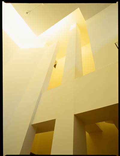
This triple height chapel has been carved from the lower floors of a banal office block on Peter Street in Manchester. The large room or volume is surrounded by circulation space, through which shines natural light. The long light from the west shines directly into the chapel in the evening. At ground floor level, at the front of the building, the designers have manipulated the barely double height space to accommodate a reception and bookshop with a tiny reading room.

OMI Architects, Manchester 1998

Posted in Churches, CiA, Interiors, Manchester, Precedents, Sally Stone, Stone/Brooker | Comments Off on Church Of Christ Scientist, Manchester

The Scots-Italian Connection


James Robertson, a Ph.D student at the Manchester School of Architecture, has been awarded a Rome Scholarship in Architecture at the British School at Rome for the 2008-09 academic year. James will be continuing his research intended to  illuminate and challenge the received wisdom about the Glasgow architect Jack Coia and the ecclesiastical work of his practice Gillespie, Kidd and Coia. James’s period in Italy will allow him to cover three particular aspects of his study in detail, namely the influence of Coia’s Italian heritage and his travels there from the 1920s onwards, the relationship between his Scottish Catholic clients and the liturgical changes promoted by the Vatican in the mid-twentieth century, and the relationship between architecture and contemporary artists between the 1920s and the 1960s. James’s studies are supervised by Eamonn Canniffe and Dr. Bill Brogden (Aberdeen University).


A virtual tour of the British School at Rome is available HERE.


Posted in Aventinus, CiA, Rome, Students | Comments Off on The Scots-Italian Connection

Card No.4

Good design has more than one reason.

Posted in Architecture Hacks, CiA, Crompton | Comments Off on Card No.4

Park Hill: Decked out

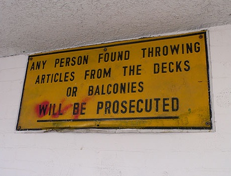
Following our recent items about Robin Hood Gardens, a link to a great collection of pictures of Park Hill, Sheffield (1961, Architects: Jack Lynn and Ivor Smith). CLICK HERE. The pictures include images of the proposed refurbishment. See also this description of the scheme and facade treatment and some strategic/financial stuff.

Posted in CiA, Dominic Roberts | Comments Off on Park Hill: Decked out

St Paul’s Church and Community Centre

St Paul’s Church and Community Centre, London England, Matthew Lloyd Architects, 2004


The church at Bow is a collection of assorted elements gathered together in one building. It is modestly gothic (1878) with a cylindrical three-storey bell tower, very large pointed windows and clerestory lights, and an open nave. The ceiling over the chancel is highly decorated, the gold ribs run into the cast-iron columns, which are positioned centrally in front of pilasters between the windows within the white painted walls. It appears that the brick walls of the nave were once also painted white, but these have been allowed to peel and fade. The pews are placed around the raised altar and the organ is positioned against a blocked-up arch.

Into this mixture Matthew Lloyd Architects have inserted a two-storey steel and timber structure. It is raised high into the vaulted ceiling of the church to leave the chancel and the nave free for worship. The front of this bold curved wooden structure is supported by four enormous white painted Y-shaped steel columns, which just stand among the pews. The rear is connected to a white rectangular box of a quite different nature, and contained within this is the meeting room and stairs to the gallery, gym, and community rooms at first and second levels. The building has been split three-dimensionally into two L-shaped sections. The church occupies the L at the front and ground level and the community use the L at the top and back of the building. The language of the new is quite different to that of the old, but then, each area is an assemblage of different styles, components and functions, the solution of which seems to work.

Photo by G.J. Brooker

Posted in Churches, CiA, Interiors, Precedents, Sally Stone, Stone/Brooker | 2 Comments

Card No.5

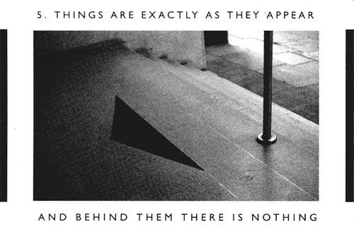
Things are exactly as they appear and behind them there is nothing.

Posted in Architecture Hacks, CiA, Crompton | Comments Off on Card No.5

Robin Hood Gardens again

Following the post by Aventinus below more writers express their scepticism about the qualities of the Smithsons’ Robin Hood Gardens: Part iv and Fantastic Journal and Neighbourhoods.

Building Design are pushing 1000 names. Were you emboldened?

Posted in CiA, Dominic Roberts, Name Dropping | 1 Comment

Furnishing the urban interior

This short film documents a study of the mediation between urban and interior space, historic fabric and the contemporary city. This research through design was produced by Year 5 students in Continuity in Architecture, and was intended to remember, to reveal and to construct. Adjacent to Piazza Duomo, the locus of the exploration, the fourteen bays of the loggia of the Broletto, presents an ambiguous but potent site. Raised from street level, but open to the public realm, it is a civic memorial to the dead of the resistance as well as a survival of Milan’s medieval commerce. In a heavily constrained response to this context, the students created a new narrative for the site, using their theoretical narrative for an interpretative project within the protected urban environment of central Milan. They proposed ephemeral structures to embody their speculative positions, and judged how their intervention will lead to a new reading of the historic civic realm. Each student specified the issue for which they designed a temporary pavilion, including spaces and surfaces for storage and display, for the dissemination of information and advertising, but above all for the re – reading of the city.

Posted in Aventinus, CiA, Milan, Student Projects, Studio Programme Year 5 | Tagged , | Comments Off on Furnishing the urban interior

Anthropomorphic house

This one is different, it has nostrils.

(Viollet-le-Duc)

Posted in CiA, Crompton | Tagged | Comments Off on Anthropomorphic house

Gritstone Venetian

P3091227.JPG

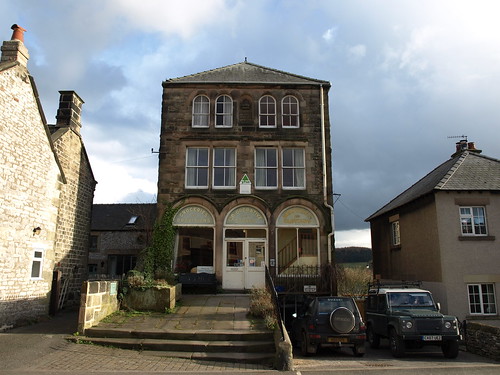
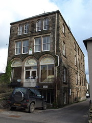
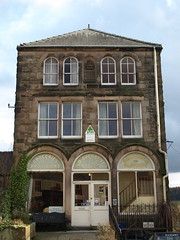
Former Co-op building on the main street of Youlgrave, Derbyshire. Now the Youth Hostel.

P3091230.JPG P3091226.JPG

Posted in CiA, Dominic Roberts, Venice | Comments Off on Gritstone Venetian