Meier versus Mayor

Is their heritage safe in Roman hands? To return to a question which has been asked previously on this blog, the new ‘post-fascist’ Mayor of Rome, Gianni Alemanno, has raked up an old controversy with his suggestion that Richard Meier’s two year old Museo dell’ Ara Pacis should be demolished. Ignore its popular (indeed even vulgar) success with last year’s sacrilegious Valentino exhibition, or this year’s rather more enigmatic collaboration by Brian Eno and Mimmo Paladino. Ignore the critical success of the museum building, outside the sniffiness of the thwarted Roman architectural establishment. Ignore the success of the public space which ties it into the city. Here is a building which requires, nay demands, destruction!

News background:
Rome mayor vows to remove museum
Rome Mayor Gianni Alemanno Upsets The Italian Elites
Mayor Alemanno Wants to Move the Ara Pacis Building?

Posted in Aventinus, Buildings at Risk, CiA, Italy, Rome | Comments Off on Meier versus Mayor

Muzio v Ponti


Created with Admarket’s flickrSLiDR.

Giovanni Muzio’s Ca Brutta (1923) faces Gio Ponti’s Palazzo Montecatini (1936) across the junction of Via Fillipo Turati and Via Moscova in Milan. The buildings were completed within fifteen years of each other and display different approaches to to a similar problem: how do you make a facade which forms a thin sheath on a modern structural frame? Muzio in the Ca Brutta (‘Ugly House’) chooses to ignore the structural concrete frame beneath and emphasise the individuality of the residences and homeliness of the building. This was an explicit rejection of the ‘renaissance palazzo’ type as a model for urban housing in which the individual apartments would be dominated by the overall composition. The sense of bricolage in the Ca Brutta was implicit in the client’s brief – Muzio was required to incorporate windows that had been purchased before the scheme was designed. The Palazzo Montecatini is of course a different building type: a headquarters building. The central entrance is emphasised and the window frames are pushed to the face of the cladding. The central block in the composition includes vestigial acroteria perhaps indicating a root for Ponti’s style in the clasically derived rational architecture of Vienna at the turn of the century.

Ca Brutta

Posted in CiA, Dominic Roberts, Gio Ponti, Giovanni Muzio, Italy, Milan, Precedents, Travel | Tagged , , , , | Comments Off on Muzio v Ponti

Academic reads Telegraph shock

screenshot6.jpg

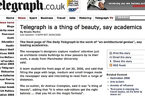
Our own Andrew Crompton describes the front page of the Daily Telegraph as “a thing of beauty”. More beautiful perhaps than the usual academic read: Guardian Education jobs.

Link to Daily Telegraph article.

Posted in CiA, Dominic Roberts, Press | Tagged , | Comments Off on Academic reads Telegraph shock

Expo Zaragoza 2008

maser2.jpg

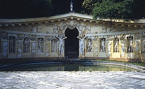
Eamonn Canniffe has been invited to contribute photographs of Italian villas to the interactive exhibition which will feature in the Italian National Pavilion at the 2008 Zaragoza Expo. The theme of the Expo ‘Water and Sustainable Development’ will be represented in the pavilion, sponsored by the Italian Foreign Ministry, in a display which features

‘our common historical past: from the marvellous achievements of the Roman Empire to the Middle Ages and Renaissance water mains and Leonardo da Vinci’s hydraulics systems. An interactive map – running around the walls with plasma screens waiting to be “interrogated” by the visitors and equipped with holograms – is both the packaging and the leitmotif of all the material on display, alternating between examples of state-of-the-art technology and brilliant solutions designed by geniuses of the past.’

The gardens featured include Villa Lante at Bagnaia, Villa Barbarigo Dona delle Rosa at Valsanzibio, and the Villa Barbaro at Maser, all of which are illustrated on guttae

The site for the Expo and for the Italian Pavilion.

paditalia1.jpg

Posted in CiA, Italy, Sally Stone, Spain | Comments Off on Expo Zaragoza 2008

Always a delightful scene

Architecture as uplifting spectacle: Moor Lane flats, Preston, November 2001.

Video by George D Thompson

Posted in CiA, Dominic Roberts, Preston | Comments Off on Always a delightful scene

House for two people who do not talk

tatton-lodge.jpg

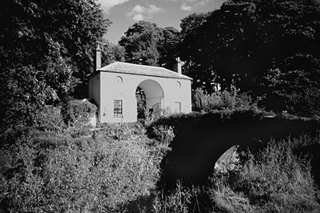
The repetition of the arch over the river and the arch over the drive echoed in the roundels is beautiful.
(Tatton Lodge, Cheshire)

Posted in CiA, Crompton | Comments Off on House for two people who do not talk

Torpedo Hall

754729262_19d6a790f2.jpg

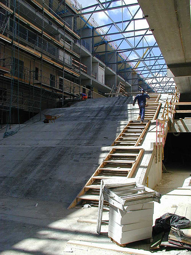
We have been corresponding with an architect member of the the design team for this project at Danish practice Tegnestuen Vandkunsten. The scheme involved stripping back the existing building, a hangar for the maintenance of torpedo boats, and inserting apartments and car parking.

Jens Kristian Seier writes: This is the first project I worked on at Tegnestuen Vandkunsten. It is the reuse of a 1953 navy shipyard structure as housing. It is in the old naval area, Holmen, in central Copenhagen, full of canals and old trees – one of the canals going right into this house. The concrete columns, steel trusses and the canal are kept from the original structure. The old columns and trusses support the new roof and all exterior steel: stairs, bridges, and balconies. The new flats basically support themselves inside the perimeter of the old building.At first we were anxious that this was a bad balance between the old the the new but gradually, as the neighbouring projects tore down all signs of the local industrial heritage and supplanted them with suburban housing, we began to feel we had made the right choice. Suburban it is not. The 32×160 metre industrial frame now contains a density of flats you only find in historic town centres. The municipal pathway that everybody walks along on sundays cross right through the building and past the canal.

There is a general description, more photographs and drawings of the Torpedo Hall Apartments here.

518758498_048abd5542.jpg

Pictures by Seier+Seier+Seier including construction photographs.

tegnestuen vandkunsten aps

Posted in CiA, Dominic Roberts, Friends & Acquaintances, Precedents | Tagged , , , , | 3 Comments

The bed of a hero

clouds-hill-11.jpg

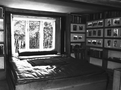
Leather, of course. The Kitchen is done out like a submarine with tin-foil wall paper and a port hole. (T.E. Lawrence’s cottage, Bovington Camp, Dorset).

Posted in CiA, Crompton | Tagged | Comments Off on The bed of a hero

Pilar and Joan Miró Foundation

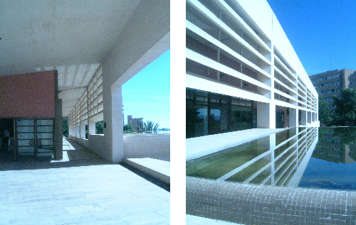
The designer can create small valuable elements within a much larger composition that can affect the quality of a much larger space. Within the hot climate of Mallorca, Rafael Moneo has used the natural qualities of light and water to create an atmosphere of coolness and character.moneo.jpgThe architect delicately placed the foundation building between the almond grove that spreads out over the slope below the building and the artist’s studio, which occupied the space immediately next to the road. The building is composed of a star-like volume to hold the collection and a linear element, which contains the service areas, the entrance and the schoolrooms. There is a very tense relationship between these two contrasting elements. The long thin building is placed on slightly higher ground than the splintered building; stairs within the foyer offer access to the lower gallery areas. This slight disconnection is emphasised by the pools of water, one of which is actually placed upon the roof of the lower building. The landscaping also reinforces this difference, the upper level is organised in an orthogonal manner, while the lower gardens are as dynamic as the star-like building. The upper rectangular building has integrated into it, a south-facing colonnade and from here the visitor has a magnificent view over the top of the gallery, across the island to the sea. This arcade also acts to help cool the building. This slender out-side space shades the enclosed rooms, therefore reducing solar gain. The narrow shape encourages air movement, thus creating a slight wind, which again aids cooling. This is supported by the louvers within the top half of the façade, they also stimulate air movement by encouraging the hot air to speed up as it rises through them. The pool of water directly below this area provides cooler air to replace this, and thus a small isolated stack effect is created. The movement of the water enhances the quality of the atmosphere, as it ripples, it is reflected onto the underside of the colonnade and into the interior space. A small detail that creates a beautiful and effective environment.Name: Pilar and Joan Miró FoundationLocation: Palma de MallorcaDate: 1993Designer: Rafael Moneo

Posted in CiA, Precedents, Sally Stone, Spain, Stone/Brooker, Travel | Tagged , , , , , | 1 Comment

Card No.1

card-1.jpg

Click HERE for the full set of cards…

Posted in Architecture Hacks, CiA, Crompton | Comments Off on Card No.1

Card No.2

card-2.jpg

Geometry up north. Wooden heart.

Click HERE for the full set of cards…

Posted in Architecture Hacks, CiA, Crompton | Comments Off on Card No.2

Card No.3

card-3.jpg

This is architecture. Gets easier as you go on.

Click HERE for the full set of cards…

Posted in Architecture Hacks, CiA, Crompton | 1 Comment