Interventions Exhibition

cubeopening.jpg

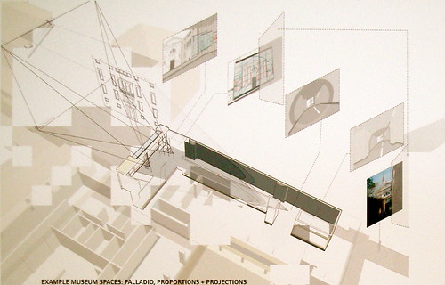
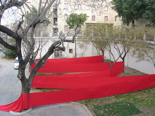
The ‘Interventions’ Exhibition at CUBE opened at the end of June and runs until the middle of September. The exhibition features work from the Atelier Barcelona/Manchester run by Sally Stone and Nick Dunn in collaboration with the Architecture School at UPC Barcelona. The CUBE Gallery is on Portland Street in Manchester (Location).

Buy the book!

Posted in CiA, Manchester, Sally Stone, Spain, Student Projects, Students | Comments Off on Interventions Exhibition

The Great Stone

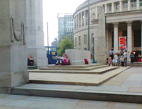
The War Memorial in St Peter’s Square, Manchester has had problems for a few years now. The construction of a Metro stop made it into an overspill for the platform space. The openess of the memorial precinct appears to have undermined any sense of it being different from the surrounding pavement. The Cenotaph, a version of Lutyens’ original, struggles to register in a scene dominated by signposts, lamps and poles and the Vincent Harris buildings beyond.

The Great Stone

It is interesting to see the informality of use especially on a hot summer day. In the picture a couple find shelter in the shadow of the Great Stone apparently indifferent to the wreath placed to commemorate the 90th anniversary of the The Battle of the Somme. The subtle connotations of altar and tomb do not register. Others sit or lie along the perimeter wall. The memorial has become a shallow, stepped landscape blasted by the sun.

In his AA Files article The Secret of the Cenotaph Andrew Crompton reflects on the genesis of the design of the original Cenotaph and Great Stone particularly the significance of geometry in their composition.

Also, have a look at The Electric Cenotaph.

Posted in CiA, Dominic Roberts, Edwin Lutyens, Manchester | 1 Comment

Thought for the decade…

‘In contrast to Rem Koolhaas’s notion that freedom is an absence of
architecture – as, for example, when he describes the open space of a town
square as embodying the greatest possible freedom – we side with Rossi’s
belief that freedom in Koolhaas’s sense is vacuous; that, in fact, it is the
constraints of architecture, its formal particularity and persistence beyond
any functionalist determination, that truly embodies freedom. For in being
neither uniformly open, nor uniformly closed, it lies open to the unforeseen
as it works on our changing activities over time.’

Reiser + Umemoto ATLAS OF NOVEL TECTONICS Princeton Architectural Press
2006 page 23

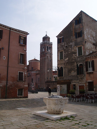
near san sebastiano

Near San Sebastiano, Venice

Posted in Aventinus, CiA | Comments Off on Thought for the decade…

Analogue and Digital

clock.jpg

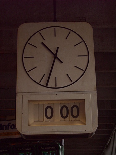
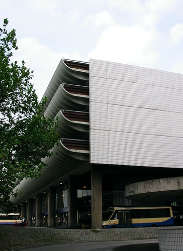
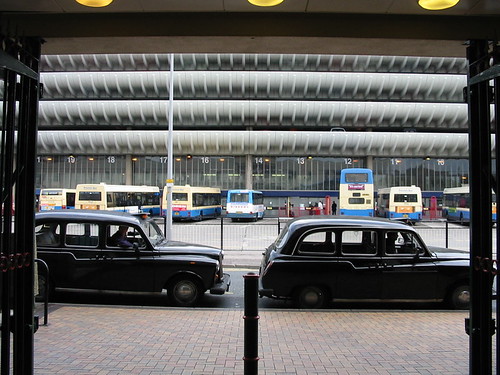
Another minute in the death of Preston Bus Station, soon to be demolished. The use of analogue and digital time displays was a compromise of the late ‘sixties and early ‘seventies as people got used to decimalization and the 24 hour clock. The clock face was easier to read at a distance while the digital display could be compared with the advertised times of buses. The overhead double clocks, now broken, provided a continuing education in 24 hour notation. As schoolchildren we looked at the double display and wondered which time to believe and follow. Occasionally we experienced the freezing of time, digital and analogue, as the power was cut during the “Three Day Week”.

preston bus station

bus station

Clock picture by “eat at joes”

Location

Posted in CiA, Dominic Roberts, Preston, Preston Bus Station, Travel | 1 Comment

Letter to the Editor

friargate.jpg
The vision published in the Lancashire Evening Post
June 5 2006
Location

The text of a letter published in the Lancashire Evening Post on Friday 23 June:
“It is difficult to understand the point of the drawings of the proposed developments in Preston on your front page (Evening Post, June 5). They appear to show the complete demolition of Friargate and its reconstruction as a suburban business park. It is a ham-fisted vision. The Council say we should not take the drawing seriously as a proposal. Why then was it issued? Is it beyond the Council to produce a proper urban design and architectural strategy for the area if their aim is to propel the city to European status? There are numerous European examples of the proper integration of new developments with historic structures and city patterns.” Sally Stone, Manchester School of Architecture

fishergate

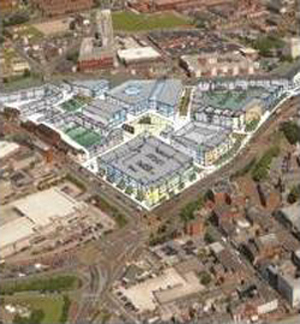
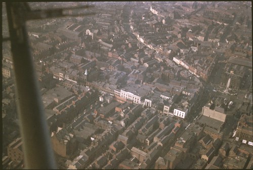
Preston in the ’50s. Friargate is the curved street running from the top centre of the picture. The new proposals are for the area at the top of the picture. Click on the image for more aerial views of Preston in the ’50s.

Posted in CiA, Press, Preston, Sally Stone | 1 Comment

Beyond the Fragile Geometry of Space

P1010079.JPG

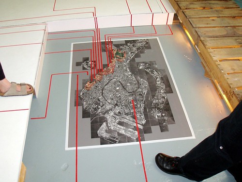
Beyond the Fragile Geometry of Space. Studio 6 (Tutors Eamonn Canniffe and Renata Tyszczuk) – University of Sheffield School of Architecture: Exhibition at Sylvester Works Sheffield (Location, exhibition now closed). The studio projects dealt with the possibilities for the northern edge of Venice of the proposal to build a ‘sublagunare’ underground rapid transit system between Marco Polo Airport and the island. Stretching from the Sacca della Misericordia to the Arsenale the projects were developed as a group masterplan with a series of individual interventions, each of which dealt with the down-at-heel historic fabric or proposed new islands for transport, museological or environmental uses. As an ensemble the projects in effect create a new facade to the city, opposite to David Chipperfield’s extension to the cemetery on the island of San Michele.

P1010075.JPG

P1010071.JPG

Eamonn Canniffe has now moved to Manchester School of Architecture: e.canniffe@mmu.ac.uk

Posted in Aventinus, CiA, Italy, Student Projects, Venice | Comments Off on Beyond the Fragile Geometry of Space

Toronto Project

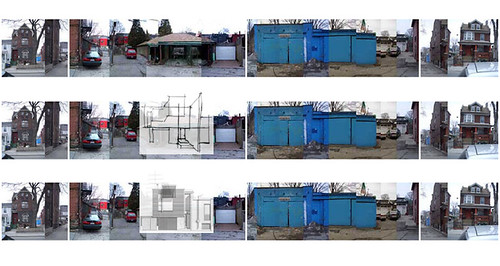
site motage.jpg

John Johnston formerly a studio tutor at Manchester School of Architecture now finds himself in Durham, North Carolina, where he is setting up a practice and doing some independent property development. John’s professional life has taken him from Texas to Manhattan, Manchester and Toronto. We asked him what he was up to and he sent us this project from Toronto: Sustainable house for a city lane (replace one garage). Location. John writes:

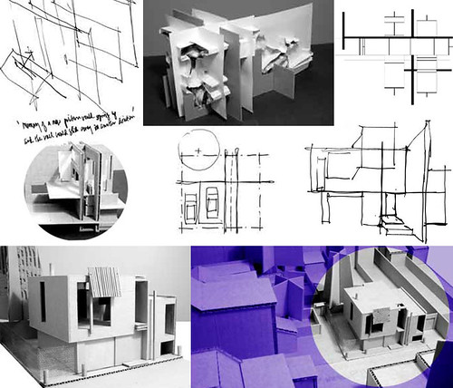
“With this project I am continuing my exploration of a process-driven approach to architectural design that I have developed in earlier projects and at the same time adapting it to the needs of a particular site and client. My approach emphasizes an aleatory process over a commitment to a predetermined end form. I often take as a starting point something from a previous project, and then methodically change it in a step-by-step fashion. Typically, I manipulate the item by constantly re-interpreting it in different media: free-hand drawing, cardboard and paper models, photographs, electronic models, and combinations thereof.

For this project the process has revolved around a few goals (organization using intersection, manipulation of natural light, and the balancing of opposites) and settled on a formal concept that relates to the backs of the neighboring houses, which shift forward and backward from one another along the axis of their party wall divisions. Where a garage now sits, this house is to be built compactly and efficiently, in an ecologically responsible manner that saves precious resources. It makes a minimal footprint, relies on the existing infrastructure of the city, and is designed to minimize non-renewable energy use. At the same time it provides a modern and highly individual urban retreat.

The main entrance is directly off the lane along a concrete block wall that continues internally, organizing the metal staircases and a bath and kitchen ‘core’, while dividing the house into three areas of high-ceilinged, open living space. The north-south axis of the staircases connects interior spaces to each side while visually linking the front to the back. There are two distinct garden areas to the back of the house, and both roof levels are planted. The concrete and steel structure employs natural and recycled building materials. ‘Green’ mechanical systems and passive solar design elements supplement heating needs that are greatly reduced by the high quality, well insulated construction of the building envelope.”

John L Johnston, Architect NYC & Durham NC
process collage.jpg

Posted in CiA, Dominic Roberts, Friends & Acquaintances, Practice | 1 Comment

Appearing Rooms

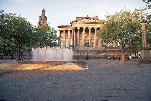
Appearing Rooms by Jeppe Hein has been installed on Preston Flag Market as part of Art 06. It consists of walls of water defining four square rooms. The water walls switch on and off intermittently to allow users to move from one space to another. Users choose whether to follow the path prescribed by the opening and shutting of the jets or to crash through the walls of water. The installation is successful and popular. Location.

Harris Museum & Art06

Photographs by Luke Bosman (upper) & M. Liebenberg (lower)

Posted in CiA, Preston, Sally Stone | 2 Comments

The Temple

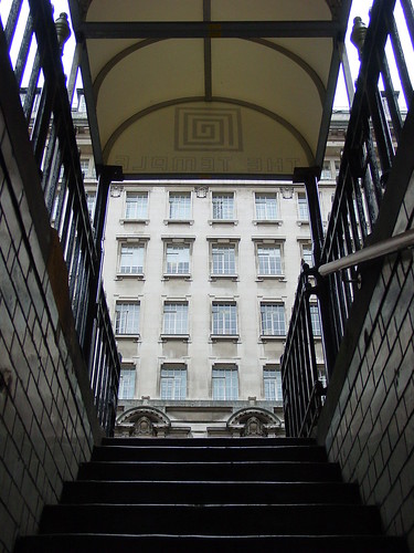
st james from temple

Leaving The Temple of Convenience is a fine architectural experience. A former underground toilet, the bar borrows a superstructure of bold Edwardian commercial architecture from nearby buildings. You don’t fall out of this bar – you rise out of it. On a bad night, leaving the Temple is reminiscent of the last few verses of Inferno with Dante and Virgil emerging from the rings of Hell via the scaly wings of Satan – the pristine Edwardian Baroque of the St. James Building is like a promise of purification (60 paces from the bar fridge to the façade of the building beyond) with a white masonry elevation thinning on one side, framed glass wall spreading on the other. From buried room to proud façade in a few significant steps. There have been subterranean bars and clubs before, but could any of them oppose darkness and compression with such illuminated, upright optimism?

…..There is below,
As far from Beelzebub as one can be

Within his tomb, a place one cannot know
By sight, but by the sound a little runnel
Makes as it wends the hollow rock its flow

Has worn, descending through its winding channel:
To get back up to the shining world from there
My guide and I went into that little tunnel;

And following its path, we took no care
To rest, but climbed: he first, then I – so far,
Through a round aperture I saw appear

Some of the beautiful things that Heaven bears,
Where we came forth, and once more saw the stars.

Dante Alighieri, Inferno, Canto XXXlV, trans. Robert Pinsky

Location

Posted in CiA, Dominic Roberts, Manchester | Comments Off on The Temple

Interventions

CUBE 6.JPG

The INTERVENTIONS exhibition opens at CUBE on Wednesday evening at 6.30pm.
Exhibition Location

Interventions is an exhibition of the work of a group of students from the college of Continuity in Architecture at Manchester who worked with the students from the Recycled Architecture Unit at the University in Barcelona. They created installations, first in February in Barcelona and then in May in Manchester. Interventions is a record of this process.

interventions

Buy the catalogue at CUBE for a fiver.

Posted in CiA, Manchester, Publications, Research, Sally Stone, Spain, Student Projects | Comments Off on Interventions

Parc Bach

camlin1.jpg

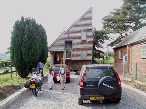
Camlin Lonsdale Landscape Architects of Llangadfan in Powys held their summer barbecue this weekend and offered us the chance to revisit their studio designed by Dominic Roberts and constructed by Robert Camlin. The building was conceived as one boundary/edge of a working farm and brings an urban sensibility to the farmyard, defining the limit of the open space. The client constructed the building out of local timber (including ‘green’ oak cladding from the Powys Estate) and after ten years it is weathering beautifully and merging with the hedgerow marking the limit of the village settlement. Go to Francis Roberts Architects for more pictures, drawings and concept sketches. Camlin Lonsdale are involved in a number of important urban schemes. Building location.

P1010076.JPG P1010066.JPG

Posted in CiA, Practice, Sally Stone, Travel | Comments Off on Parc Bach

Facades & faces

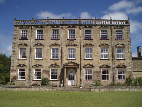
netherwitton hall

Nether Witton Hall, Northumberland. Pevsner in ‘The Buildings of England: Northumberland’: “…c.1700-1710…square block seven by three bays, with top balustrade and quoins. All windows with pediments, but three varieties used in an order difficult to follow: straight-sided open, segmental open, and segmental open with scrolly ends.”

netherwitton hall

The effect of the facade is quite disconcerting and amusing. What system governs the arrangement of the differently treated windows? The decision to have three pediment variations seems too much for the building and leads to an interruption of rhythm. Even the Palazzo Farnese makes do with less variety on each storey. The eccentricity of the pattern undermines the authority of the building and, after all, makes it likeable.

Location

Posted in CiA, Dominic Roberts, Travel | Comments Off on Facades & faces