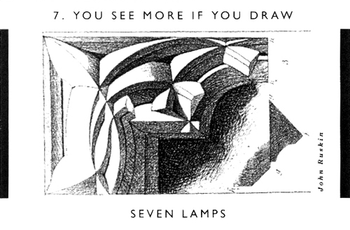
Card No.7

You see more if you draw.

Posted in Architecture Hacks, CiA, Crompton | Comments Off on Card No.7

Adolf Loos: Anachronistically Alpine?

Following the Christmas post below, a few slides of the Khuner House by Adolf Loos (1930).Created with Admarket’s flickrSLiDR.

Contemporary to the whitewashed masterpieces of his last phase…this country house that is so vernacular, so anachronistically alpine, so rustic, raises a theoretical question…to what extent this manifest contradiction of languages reveals a poetic dissociation, a sort of architectural schizophrenia..…If, set in the world of the metropolis, Moller House shows the extreme reticence of nihilismus, Khuner Country House…speaks the dialect of the place. Loos substitutes the logical modesty of building works with deep roots in their site for the fetishism of the ‘grand form’, of the narcissistic search for poetic consistency: “To bring materials from far away is more a question of money than of architecture. In mountains rich in timber, one builds in wood; on a stony mountain, stones will be used”.*From Adolf Loos by Benedetto Gravagnuolo, p204

Posted in Adolf Loos, CiA, Dominic Roberts, Mitteleuropa, Precedents, Travel | Comments Off on Adolf Loos: Anachronistically Alpine?

Loos Haus

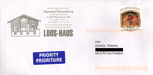
In the years since our first visit to their Hotel-Restaurant the Steiner Family have, every Christmas, sent us a sprig of vegetation from the forest surrounding their building, better known to architects as the Khuner House by Adolf Loos. Guests can stay, relax and eat in the almost unaltered environment of the house, a place which brings out the architect’s concern for homeliness, comfort and contextual materials (it is made of logs). The food is exceptional and the view is magnificent.

Happy Christmas.

Alpenhof Kreuzberg

Posted in Adolf Loos, CiA, Dominic Roberts, Mitteleuropa, Name Dropping, Restaurants, Travel | 1 Comment

LOXFORD TOWER RIP

 It may interest ex-Manchester Polytechnic students of Architecture that Loxford Building is being demolished. Although the School of Architecture moved out of the building some eight or so years ago, for many years before that it was the seat of disorder, mayhem, culture and learning. There are many who remember the studios as the venue for table-tennis tournaments, football matches and even on one memorable afternoon, a barbeque.

 Loxford Tower will be replaced by an “iconic building” to house the Business School and Student Hub designed by Fielden Clegg Bradley


Posted in Buildings at Risk, CiA, Manchester, Nostalgia, Sally Stone | Tagged , , , , | 10 Comments

Renaissance Siena: Art for a City

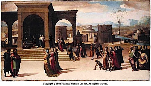
The current exhibition at the National Gallery in London “Renaissance Siena: Art for a City” presents many unfamiliar delights to the eye. Along with the occasional massive altarpiece, the multifarious work of Francesco di Giorgio Martini in drawing, painting, sculpture and architecture, the reuniting of sequences of heroic figures from distant museum collections and the final room with its sequence of works by Domenico Beccafumi, a vivid image of an urbane culture is presented. Needless to say, as in this example from the National Gallery’s own collection, Beccafumi’s “The story of Papirius”, many of the items are set against or within ideal cityscapes which contrast with the softness of that artist’ use of line. Marvelous, awe-inspiring, life-affirming.

National Gallery Siena Exhibition
The exhibition closes on January 13 2008

Posted in Aventinus, CiA, Italy | Comments Off on Renaissance Siena: Art for a City

Compare and Contrast

Ph.D. candidate James Robertson is continuing his research into the early career of Jack Coia and has recently visited both the Sir Basil Spence exhibition in Edinburgh: Back to the Future (Dean Gallery, Edinburgh), and the Gillespie, Kidd & Coia exhibiton in Glasgow: Gillespie, Kidd & Coia: Architecture 1956-1987 (The Lighthouse, Glasgow). James writes

“The recently opened Gillespie, Kidd & Coia exhibition, based at the Lighthouse Centre in Glasgow, is essentially a showcase for the architectural careers of Isi Metzstein and Andy MacMillan. Whilst it is an informative expose of their contribution to the architectural output of Gillespie, Kidd & Coia, its great fault is that it fails to contextualise their work, and attributes apparently little to the heritage of the firm, barely acknowledging Jack Coia himself. In a small, barely noticeable newspaper cutting, Jack Coia talks of the “collective personality” of his office (referring to the atelier ethos, where student and professional alike were permitted to contribute freely to the architectural discourse surrounding office projects). It is ironic how this ethos has been subverted or even dismissed.

The exhibition starts, in 1956, with St. Paul’s, Glenrothes, hailed as a seminal building in terms of Modernism in Scotland, with Metzstein and MacMillan apparently breaking the ecclesiastical mould of the firm. As Johnny Rodger highlights in his contribution to the catalogue which accompanies the exhibition, Gillespie, Kidd and Coia had produced churches which had been viewed as very much “of their time”. The younger architects’ unsentimental, rational approach may be obvious and even pioneering in terms of ecclesiastical “style”, but to what extent were “their” churches based on genuine liturgical and social functions, and not on the “whole rag-bag of contemporary cliches” so abhorred by Peter Hammond in his contribution to Modernism and the Architecture of the Church.

The question of whether a church should be recognisably a church or whether Modernist principles should dictate its appearance is pertinent when considering 20th century ecclesiastical design. Coia’s contemporary, Sir Basil Spence, of course famously re-designed Coventry Cathedral following its Second World War destruction. Charles McKean describes Coventry as a “box for Arts and Crafts”, and as picturesque in its setting. This appreciation or concern for context is also recognisable in Coia’s early churches, their Italianate expressiveness “cutting a dash in the landscape”. However, Hammond, in his critique of the modern church, dismisses Coventry Cathedral as merely pandering to visual effect in its rather “pictorial” or “romantic” conception.

An early chance to compare Coia and Spence was provided by their participation in the 1938 Glasgow Empire Exhibition. Coia’s Roman Catholic Pavilion and Palace of Industries North were both at odds with his initial work since becoming principal of the Gillespie, Kidd and Coia practice in 1927, having both been designed along decidedly Modernist lines. In contrast Spence offered something more traditional in his House for the Council of Art and Industry. Against this conservative approach, this difference suggests that at that stage in their early careers Coia was so gifted and comfortable with the concerns of particular clients that he was able to literally decide on the correct or appropriate course of design according to the given situation (in some cases, such as at the 1938 Exhibition, more or less pleasing himself within certain predetermined guidelines, which were largely to do with construction technique and timescales). This idea also resonates with Coia’s popularity amongst his students: if he was not believed to have been a truly modern thinker and designer, with this emphasis later seemingly conferred on Metzstein and MacMillan, why was he so popular and well remembered by his students? He must necessarily have been conversant with architectural progress and advancement to so inspire his students. Indeed, on Thomas Warnett Kennedy’s first meeting with Coia, he declared that his “own imagination lit up like a lamp”.

One of the fundamental problems of the school of thought that places Metzstein and MacMillan at the creative helm of the firm, post-1956, is that both Coia’s name and that of the firm appear on more modern buildings than Metzstein and MacMillan are perhaps prepared to admit. The authorship of drawings, therefore, creates an ambiguity over the (currently one-sided) intellectual ownership of the Glasgow firm’s architectural output and indeed the relative reputations of Coia and the more professionally successful Spence.”

Basil Spence & the Coventry Cathedral model
Basil Spence
The Lighthouse, Glasgow

Posted in Aventinus, Churches, CiA, Research | Tagged , , , , , , , | 1 Comment

Heartbreakingly Picturesque

With neighbours like these one senses that this piece of old Manchester will soon be shouldered into oblivion.

(Picture taken on Upper Brook Street, Manchester)

Posted in Buildings at Risk, CiA, Crompton, Manchester | 3 Comments

From the hillside


Created with Admarket’s flickrSLiDR.

Summer Hill near Ulverston in Cumbria in changing light, November 2007. The house is an extension and reuse of one side of a small Georgian country house. Phase 2 of the project will see the conversion of the main house. Architect: Dominic Roberts at Francis Roberts Architects.

Posted in CiA, Practice, Sally Stone | Tagged , , , | Comments Off on From the hillside

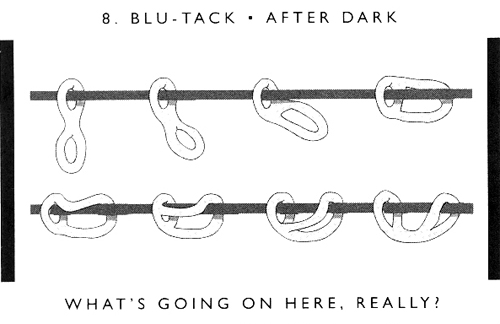
Card No.8

Blu-tack after dark.

Posted in Architecture Hacks, CiA, Crompton | Tagged | 2 Comments

Big Wheel thrills

The post millennium trend for erecting a big wheel in the centre of provincial towns has finally reached Preston. This one is positioned on the Flag Market, immediately in front of the Harris. It provides spectacular views across the city on the way up and on the way down, an intimate examination of the Harris’s pediment. A fantastic experience, but hold on tight!

Posted in CiA, Preston, Sally Stone | Tagged , , | 1 Comment

Photo-story

SMOKEBELCH has a nice Preston Bus Station post.

Posted in Buildings at Risk, CiA, Dominic Roberts, Preston | Comments Off on Photo-story

How to end a staircase

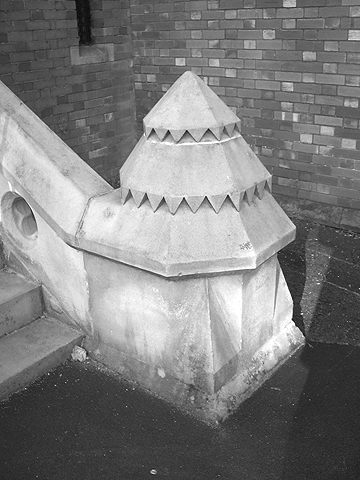
Not at all flimsy, the low balustrade makes this octagonal spike seem even bigger than it is.
Architect: Alfred Waterhouse, Cheadle Hulme School.

Posted in CiA, Crompton, Manchester | Tagged , , | Comments Off on How to end a staircase